Cincinnati Observatory
Branding Redesign
Known as the "Lighthouse of the Sky", the Cincinnati Observatory has been contributing to science since the 19th century. It has played a great role in educating the public on astronomy and displaying many great scientific achievements, including housing one of the oldest telescopes in America. It is a cornerstone of Cincinnati, Ohio, and needed a brand redesign to show off its importance and professionalism.


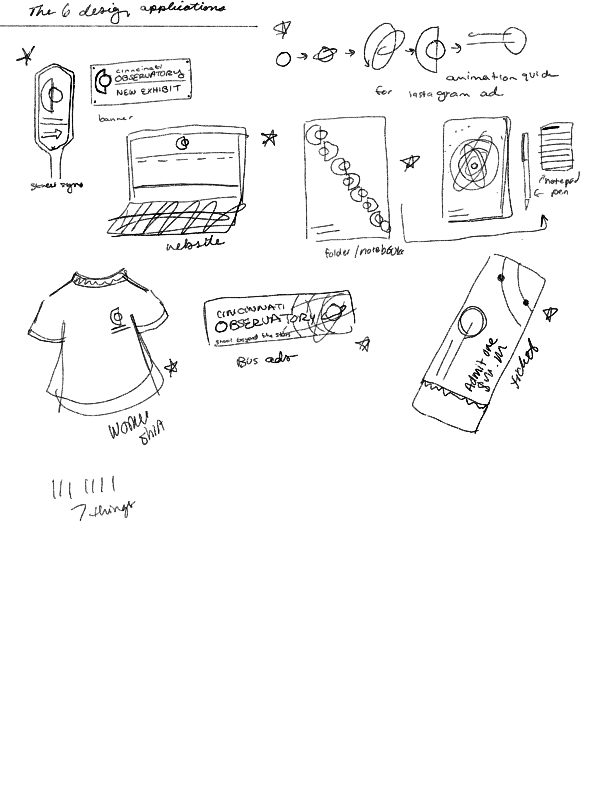
The main logo has two lockups: vertical and horizontal. The main image is the combination of a "C" and an "O" for Cincinnati Observatory. It also represents an eye open wide and observing, and it shows a moon in the first quarter phase, further adding to the astronomy aspect of the branding.


As a part of the deliverables, I created a branding guide to walk through the branding process and rules, so that future designers can keep a similar cohesiveness through the designs they create for the Cincinnati Observatory. 6 deliverables were created to go along with the branding redesign, including tote bags, business cards, stamps, shirts, posters, and outdoor signage.